|
Subscribe / Renew |
|
|
Contact Us |
|
| ► Subscribe to our Free Weekly Newsletter | |
| home | Welcome, sign in or click here to subscribe. | login |
Construction
| |
 |
June 23, 2011
Good signage points the way to better health care
BCRA

Herbert
|
Visiting medical buildings usually isn’t easy. Not only are they where some of life’s most stressful situations take place, but the facilities themselves can be confusing and daunting to navigate.
As lean processes (which stress efficiency of time, design and resources) become more prominent in health care planning, the need has grown for wayfinding and signage in medical buildings to be clear, consistent, accessible and able to reinforce an overall brand.
Health care signage problems generally result from opposite problems: a dearth of signage or an overabundance.
First, there is oftentimes a distinct lack or unclear sense of direction provided by the signage interface. This can lead not only to uncertainty, but serious danger — emergency services must be able to be found and used with the utmost efficiency.
Obviously, these problems can be bothersome as well as dangerous: How does one get from one office to another? How do clients feel they have arrived in a public rather than a private service space? Are different clinics or rooms marked distinctly with office and professional names?
The value of lean design is only effective when people are able to function efficiently. Clients and staff wandering around in confusion can lead to surprising levels of time waste for patients and staff alike.
A marketing problem
A lack of consistent signage application and standards also presents a marketing problem: How easily is a facility recognized as part of a larger “brand” if signage is nonexistent or disparate? As health care facilities and organizations become marketable resources that compete for patients and prestige, signage and exterior/interior branding become invaluable ways to identify and shape public perception of an organization in the community.
Of course, a client’s experience isn’t just in the facility itself. From the street or sidewalk all the way through the parking, the building entry points, check-in and the examination room, a smooth and well-directed experience is essential. Choreographed elements include the architectural materials, building form, landscape architectural elements, lighting, safety modalities and, naturally, the signage.
Cluttered or excess signage presents its own issues by asking patients or staff to understand intricate or subtle differences in a split second.
Lean design represents a simplification of messaging. Having too much information at any given decision-making point is just as bewildering as a lack of signage.
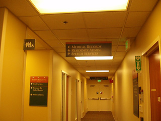
In one health care property that was analyzed for signage effectiveness, there were more than 25 signs around an elevator bank. Along with permanent signage, various temporary signs were posted with directional or instructional information. Tacked up, hand-written or hastily created signs alerting people to temporary issues seem both insensitive (by signaling the information is less important) and generally antiquated.
This kind of visual pollution isn’t simply confusing, it prevents a person from reading any of the signage at all. This idea of “I don’t know where to look, so I don’t look at all” is a major enemy of health care wayfinding — the information lacks importance and organization.
Beyond the signs
Signage and wayfinding is a language that represents a brand to the public. Like any language a company uses, it must be thoughtful so as to come across as polite and accessible. While safety and general ease are certainly the most important aspects of signage, signage is also a representation of a company speaking to a client.
With either excessive or insufficient signage, inefficiencies are created in health care delivery. A disorganized flow of patients and staff presents serious hazards to care. But with a careful, thoughtful approach to signage and wayfinding, an organization is not only giving visitors and staff a clear approach to facility use, it is presenting a cohesive, applied vision of the facility’s brand.
This kind of directional ease and branded environment is not achieved through a simple sign. In existing facilities, a signage and wayfinding package will many times consist of an overall assessment of the space.
For example, putting a check-in kiosk prominently against a contrast-colored wall will cause visitors to feel much more confident using it. Alternatively, placing the kiosk uncomfortably close to waiting room chairs where other visitors might be sitting, or simply placing it in a far off, dimly lit corner away from an entrance will result in visitors not being quite sure if they should use the traditional reception desk or are free to use the kiosk.
For signage system development, a hierarchy of signs is also important to direct attention appropriately. Applying a consistent size to certain sign types can be a simple way to ensure information is disseminated in order of its importance. That way, a smaller sign can be seen as a microstatement (“Remember to Wash Hands”) as opposed to a larger, more important piece of information (“Emergency Services — Floor 1”).
When designing signage and wayfinding, the need to educate the staff must also be taken into account. Many times, staff use a different jargon for certain spaces from the more formal directional signs that visitors see. Naturally, this can cause a certain amount of confusion between visitors and staff, and anticipating the most commonly used or descriptive term is going to be highly useful in a signage program.
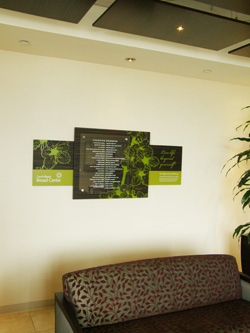
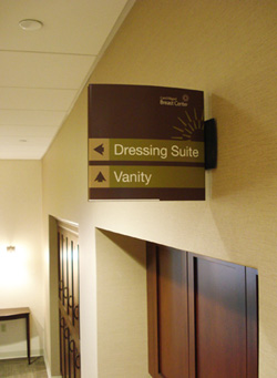
The Milgard Breast Center in Tacoma is an excellent example of signage working both for ease and defining the environment as a place of healing. Instead of the crisp, clinical look of a traditional medical facility, the partners desired a comfortable, spa-like experience where patients could feel that they were not simply being attended to, but pampered.
The signage was not only more artistic, but the wayfinding was meant to add serenity to the patient experience, with low lighting and gentle directions regarding less obvious points, such as where to disrobe.
With careful and thoughtful attention paid to signage and wayfinding, as well as a consistent and standard program, a single medical facility, a larger program, or an entire organization can benefit from a simplified, applied directional and branding system.
Michael Herbert is a senior environmental graphic designer at BCRA. His work includes signage, interpretive graphics, murals and exhibits for regional health care organizations, including MultiCare Health System and Group Health Cooperative.
Other Stories:
- 13 tips for choosing your medical space
- Study will help UW’s Montlake Tower cut energy costs
- Swedish Issaquah aligns design with patient needs
- 'Novel' process lets Swedish Issaquah hit fast forward
- ‘Hybrid’ rooms a low-cost answer to space needs
- Swedish women’s cancer center a one-stop shop
- Group Health is designing its clinic of the future
- Puyallup hospital tower puts focus on patients
- Evergreen opens center closer to its patients
- New VA complex to treat ‘emerging’ war injuries
- Friday Harbor hospital aims to be nation’s greenest
- UW expansion stays on track despite big change in plans


