Surveys
DJC.COM
October 22, 2009
How wayfinding signs can enhance your brand
Selbert Perkins Design

Perkins
|
From the minute someone enters a new environment — be it a retail district, museum, restaurant, entertainment venue or sporting arena — they look for certain visual cues to guide them around the space, whether they realize it or not. Every environment needs to visually communicate with its occupants to help them navigate and fully experience the space.
A property’s signage and wayfinding plan is often the first touchpoint visitors have with an unfamiliar environment — it welcomes them, helps them navigate a new place and immediately shapes their overall experience and feeling about that place.
For example, take The Shops at The Bravern, the retail part of the new $400 million mixed-use development in Bellevue that opened its doors in September. In addition to having the only high-end retail offering to open in the United States this year, The Bravern is also one of the largest mixed-use projects, at 1.6 million square feet. Providing a sense of the project’s scale, the parking garage alone accommodates 3,100 vehicles.
Effective signage is needed before a visitor even enters The Bravern. How do visitors locate the parking garage entrance? Once parked, how do visitors find the escalator to the stores? To welcome guests and facilitate easy navigation within the subterranean parking garage, wayfinding graphics were developed for the garage’s seven levels.

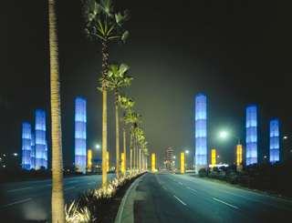
Photo by Anton Grassl The gateway at Los Angeles International Airport includes a ring of 15 pylons, each 100 feet tall, as well as equally spaced columns that steadily increase in height along a two-mile roadway median leading up to the gateway.
|
Classic design elements were implemented throughout the entire site, including entry gateways, building-top signs, parking entrance signs, pedestrian direction signs and directories throughout the retail common spaces.
Easy navigation and access shapes an overall experience. If the parking garage were a headache to navigate, customers would go elsewhere no matter how beautiful the architecture. Alternatively, a positive experience can lead to a brand-loyal customer.
Less is more
The goal of an effective signage and wayfinding system is to get people the information they need as quickly as possible by creating memorable images and messages that communicate instantly. We live in a multi-lingual word: the simpler the content, the faster it will be understood. This is accomplished through the use of symbols, color, form, scale and sometimes words.
Every project is unique, but there are common design principles that link many projects. Most important is the adage “less is more.” If there are more than three pieces of information on a sign, people will often forget details before they can use them. Additionally, if too much information is packed into a single sign, it encourages pedestrians to stop and read everything.
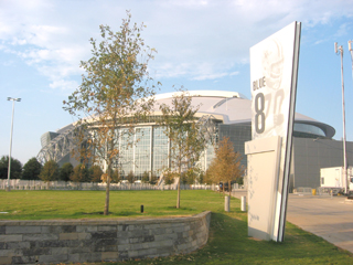
The Dallas Cowboys Stadium, for example, holds more than 100,000 fans. The stadium’s busy corridors are designed to keep crowds flowing through — if those people stopped to read text-heavy signs, major congestion would occur. It’s important to give people just enough information to get to the next sign, which steers them where they need to go.
Signs also need to fit in with the scale of their surroundings. If a sign is too big, it may look clumsy and if it’s too small, it’s not going to function. In addition, sign placement is critical as the communication must be accessible to be effective. For example, in large crowded spaces such as a stadium, directional signs should be placed overhead so they are easily read by everyone.
Enhance your brand

Image by Bowen Studios, Salt Lake City Environmental graphics reflect The Shops at The Bravern’s sophisticated brand identity, incorporating the architectural color palette. |
A strategically developed signage and wayfinding plan not only helps visitors navigate a complex space, but also enhances the brand image and overall user experience.
The gateway towers at Los Angeles International Airport, for example, express the vision, energy and diversity which embody Los Angeles. These iconic towers have transformed the airport into an exciting gateway to the city and to the country. This landmark has helped make the airport an attraction that has a very positive economic impact on the surrounding neighborhood. Additionally, these towers serve a directional function — when driving to the airport and the towers come into view, one knows they are headed in the right direction.

Photo by John Lutz/Selbert Perkins Design The signage system of the new 2.3 million-square-foot Dallas Cowboys Stadium incorporates the Cowboys’ star, colors, text and history. |
Of course, there are variances in every signage program to create a different brand experience. Signs may be designed to complement the building’s architecture. For example, in the Dallas Cowboys Stadium, the team’s color scheme was used throughout the building and the signs’ edges were angled to mirror the angled glass walls on the sides of the stadium.
The approach
Every place has a story. Every story has a place. Through a collaborative branding and design approach, designers celebrate what is unique about a place, its history and its people. The needs of every project are different and to successfully meet these needs, designers must start by listening to their partners, clients and communities. This collaborative approach is necessary to make a collective vision a reality. Early and frequent communication with everyone who touches the project is essential — architects, engineers, landscape architects, traffic consultants and all other sub-consultants — as signage and wayfinding touches upon each element within and around the site.
A well-planned signage and wayfinding system not only helps people navigate a complex space, it also enhances the overall brand image and brand experience of that environment so visitors and occupants have a positive, memorable experience.
Robin Perkins is a partner and creative director at Selbert Perkins Design, a leading global design firm with offices in Los Angeles, Boston, Chicago, Hawaii and Dubai. She holds a bachelor’s degree from the Rhode Island School of Design and studied sculpture at the Massachusetts College of Art.
Other Stories:
- Does your building measure up, energy wise?
- Green Building Council faces critical forest decision
- A welcoming new home for ACRS
- Dutch architects reinvent modular construction
- European contest spurs new ideas in sustainable design
- Architects step up to help developers
- Ballard QFC requires unique structural solution
- Knowing when to build and when to remodel
- Skyrocket your chances of winning contracts
- Can the Toyota design approach help make great places?
Copyright ©2009 Seattle Daily Journal and DJC.COM.
Comments? Questions? Contact us.